I am on much-needed vacation this week, so I will not be blogging or trading. As you can probably tell from my posts, I have been doing a lot of thinking about how to keep improving my trading lately, and I have spent a lot of time going back through my old notes and early trading journals. In lieu of writing a blog post, I want to share something I wrote in late 2002 in the form of a letter to some trader friends of mine who were struggling to achieve consistency along with me at the time. I had just come out of the “Eliott Wave” period of my trading. (I think most technical traders have that period in our background. We’re not proud of it and we don’t like to talk about it. Most of us overcame it, and we’re probably better off for having gone through it. 🙂 ) This was the precise moment in my trading life when I sat down after a Thanksgiving holiday, and realized that trading was actually a heck of a lot more simple than I had been thinking.
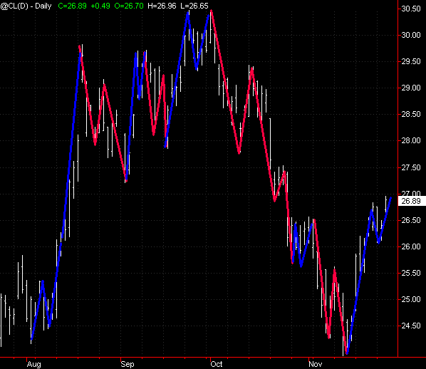
Since 2002, the direction of my trading has been constant simplification to a point of practical minimalism today. I am sharing this document, with almost no editing, for several reasons. One, it’s kind of funny to see the Crude Oil chart at $27! Two, that makes a very good point… this was 8 years ago, and absolutely nothing has changed. For all the structural changes we have seen in market microstructure, the big technical picture is absolutely unchanged. Lastly, I was right in what I wrote. I really was onto something… this is the fundamental, underlying structure that drives all price action–and it was even more simple than I thought. (And it’s kind of amusing to see me toying with ideas like maybe emotions have something to do with price patterns.) More on all of this when I get back from vacation, so without further ado, here is what I wrote to some friends in November, eight years ago:
======================================================================================
It is my proposal that there is a fundamental, underlying structure that is the same in all markets and all timeframes. Many writers have talked about waves in various contexts (Elliott, Gann, et al,) but the difference here is that I think this is actually much more simple than any of them would have you believe. I propose a “fundamental structure” is very simple and does not require intense study, complex wave counts, and does not depend on a litany of qualifications and exceptions. This underlying structure is immediately obvious when looking at any price chart in any timeframe, and should have real utility for any trader working in any timeframe. I hope what you see here will ring true and that your own observations will reinforce mine.
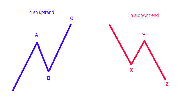
So what is this fundamental structure? Very simply, an impulse push, a retracement and another impulse in the same direction as the first. Graphically, it would look something like this:
The structure is exactly the same whether the market is in uptrend or downtrend—the only difference is that the structure is inverted. (For the rest of this, let’s forget about the downtrend for a moment and just work with the uptrend line.) Notice that there are two impulse waves (wave A and C), and one retracement wave that moves in the opposite direction of the impulse waves (B). Understand that this is just a rough schematic structure, but try to be very clear about the nuances of what I’m saying before we look at real market data.
The A wave has a sense of urgency to it. If the market has been dull and flat for some time, the appearance of an A wave is a welcome sign, and it feels like the market is coming back to life. Now, talking about how something feels may not seem very scientific, but it’s completely appropriate because I am starting to believe that these patterns appear as a result of trader psychology. I think that most of the patterns we see are not the result of manipulation by the floor traders, but are simply what happens when a lot of people have emotional reactions of fear and greed at different points in time.
It can be very hard to tell when an A wave is going to end or how far it’s going to go. Suffice it to say, one of the most amateurish trading mistakes is to buy the market near the top of the A wave and dump it in frustration near the bottom of the B. Been there and done that? I have several times this week already! Again, I think it goes back to emotions, and this is one of the main functions of the market: to create emotional reactions in the market participants. Be aware that trading according to these market-induced emotions is rarely going to be profitable. In fact, the purpose of the market is to generate emotions that cause the mass of market participants to do the wrong thing at the wrong time. We must understand this structure so that we can stand apart from the crowd! This is also why good trades feel uncomfortable sometimes. We are going against the emotional patterns of the market, but these patterns are designed to separate suckers from their money. A few last words on A waves: the slope and duration of the A wave provide a method to quantify the strength of the A impulse. Steeper and longer waves have more strength.
The B wave is a natural reaction to the A wave. B must follow A. It’s almost like a law of nature: day follows night, rest follows action, action follows rest, reaction follows action. An extremely interesting fact about B waves is that they seem to respect the ratios and proportions described by Fibonacci numbers. In other words, we expect the B wave to terminate at 38%, 50% or 62% of the length of wave A. Especially on shorter timeframes, retracements of 21% and 89% are also quite common. Though many times these points will be hit exactly and the market will turn, allow some room for noise and error. If the market is close to one of these areas start watching for a turn. Do not be upset if the market turns at 41% instead of 38%. This is all just a way of quantifying the market structure so that your brain can deal with it! You can simplify even farther and say that the B wave normally retraces 50% of the A wave, with a margin of error of about 10%-15% +/-. This statement will upset a lot of hard core fib traders, but it is the fundamental understanding. [2010 update: I was on track but a little sidetracked by all the Fibonacci ratios. I now look for retracements to end roughly within 1/3 to 2/3 of the length of the impulse wave.)
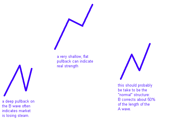
The character of the B wave tells us quite a bit about the overall health of the market. The more deeply B retraces, the weaker the trend is assumed to be. A B wave that can only pull back 21% of A is a market that is quite strong, with a real sense of urgency. In this situation, we might well expect continued moves to the upside. On the other hand, a market that pulls back very deeply (62% or more) may not even reach the peak of the A wave again. We can “feel” this on the charts. A steep and long B wave will feel like the market is giving up the gains of A, while a shallow flat B will feel like the market can’t wait to continue the move started in the A wave. I think there are some good clues about when we should be looking at counter-trend trades and when we should be looking for continuation in the strength of the B waves. Graphically, some of these B’s look like this:
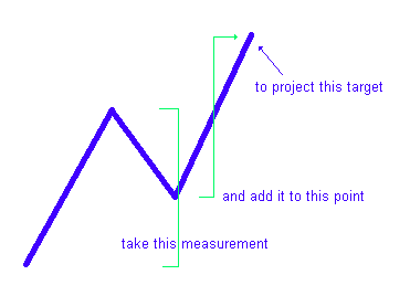
A rule of thumb for the length of the C wave is given by a “measured move objective”. This simply means the C wave will be about as long as the A wave was. To put it more mathematically, take the length of the A wave from its base to its peak, and add that value to the end of the B wave (this means we have to see the B wave turn first). This will project an ending value for C. Again, this is not rocket science, and sometimes these values will not be hit exactly, but it does give us a way to quantify the market’s action. On a chart, this looks like this:
There are other variations of this structure, but these are the most common and probably the most significant. I don’t personally feel it’s necessary to make this theory precisely account for all variations of market action; as long as it provides a basic framework that gives some sense and structure to the market, it’s doing it’s job. Remember too, the market has a certain degree of “noise” (chaos, randomness?) in the price action. This noise can distort the underlying structure and make it hard to recognize, but it is still there!
It is also important to understand that this structure is playing out in various timeframes and levels at the same time. If we are looking at a 5 minute ES chart, we can usually see the structure very clearly. It is also important to understand that the 5 minute structure is a microscopic view of the 30 minute structure, and that patterns on the 5 minute chart are going to be strongly influenced by the 30 minute chart. In other words, even if the 5 minute chart looks like a short, if the 30 minute chart is coming up to a retracement level you want to be very careful of that short. If you’re interested in predicting, the highest probability turning points occur when several timeframes give significant projections at the same levels (confluence). I have come to believe that THE key to successful trading is being aware of the influence of the higher timeframe on the timeframe you are trading. Also keep in mind that these “timeframes” are yet another arbitrary structure we impose upon the market. Why 5 minute bars and not 4 minute 45 second bars? No real reason other than convenience.
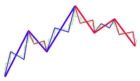
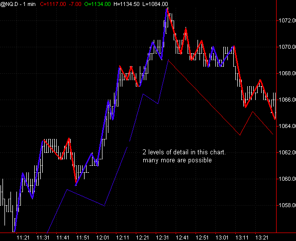
At the same time you’re aware of the influence of the higher timeframe, also be aware that the patterns you are seeing on your chart are the result of the interactions of the lower timeframes. When you go down to a certain level in the market, most markets (except for the most active) become untradeable. The stock indices work down to 1 minute bars, but most markets are difficult to trade below 5 minute bars (though equal tick bars will make recognizable patterns out of the thinnest markets.) Keep in mind the influence of this lower timeframe as well. The pauses you see in your timeframe are likely due to turning points in that lower timeframe. Patterns that appear to be aberrations are often just the normal interplay and interference patterns between waves at different levels and timeframes. The most powerful patterns happen when several timeframes roll over in the same direction simultaneously–this creates a situation with potential for intense positive feedback. You can visualize this multi-level structure something like this, being aware that everything on this chart would be part of the A-B structure of the next higher timeframe:
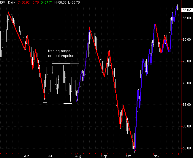
One more small but important refinement is to be aware that these are impulse waves. There are plenty of times when the market is locked in a trading range and is moving sideways. At these points, I suspect the market still respects, on some level, this ABC structure, but the level of noise to signal becomes so high in trading ranges that it is very difficult to make any directional calls. The market does clearly alternate between periods of relative rest and relative strength. In a trading range, it is usually best to stay out of trouble and wait for the emergence of real impulse. Only then can we make directional calls and forecasts with any degree of certainty. Most trading tools work best when there is a supply/demand imbalance, which will show itself on the tape as strong buying or selling.
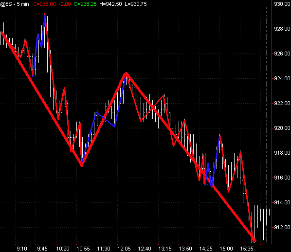
Well, that’s it for the basic structure. Let’s quickly apply this to a few charts. Notice that sometimes the ideal structure is a little skewed or distorted. Many times it will be unclear exactly how the market is conforming to the theory. This is to be expected when looking at real market data, but at least understanding this structure gives you a better sense of where the market is at any point in time:
Start looking for and watching this structure in all timeframes (down to even the tick level). Good trading!

6 Comments on “A blast from the past: A note from myself in 2002…”
Reminds me of Tony Plummer’s work.
Hi Adam,
Thanks for the nice blog post.
For me, mastering performance of a particular hobby or skill, from beginner, intermediate, to advanced/elite, started off with (1) the accumulation of domain knowledge (beginning stage), (2) the implementation of specific knowledge using a variety of systems, and finally (3) a simplification and mastering of the basics that amount for the majority of one’s quality results (the 80/20 rule).
I’ve seen it in the mastery of my non-trading career and in martial arts — the more advanced one becomes, it seems, the simpler and more focused the approach.
Have you found that to be the same process with you?
Best,
David
@Andrew: yes, i agree, but i actually wrote this before i found tony’s book. i would definitely count that particular book as an important influence in my development though. this letter grew out of a lot of thinking about wave counts (elliot style) and realizing that i was seeing the same momentum move/retracement/momentum move pattern on very short timeframes and that more complex patterns could really be the result of the interaction of that simple pattern on lower timeframes.
@David: yes. i have the same kind of experience with trading, martial arts (though it has been a few years) and music. many parallels to the learning experience in those disciplines and yes i agree the progress toward mastery is toward simplicity and a focus on basics.
Hi Adam,
i found your post very interesting and reassuring in my view that it is better to be able to follow some simple rules than always adding new ones to your playbook. Also i wanted to add,that there are different ways of looking at the same thing,but if you do it correctly,it will lead you to the same conclusion.If you describe those waves as successive patterns of higher highs and higher lows or lower highs and lower lows,you get exactly the same thing,but even simpler.
stop giving away the secret
Please write more about market fundamentals. This article helped me to sync up with the rhythm of the market. Thanks.