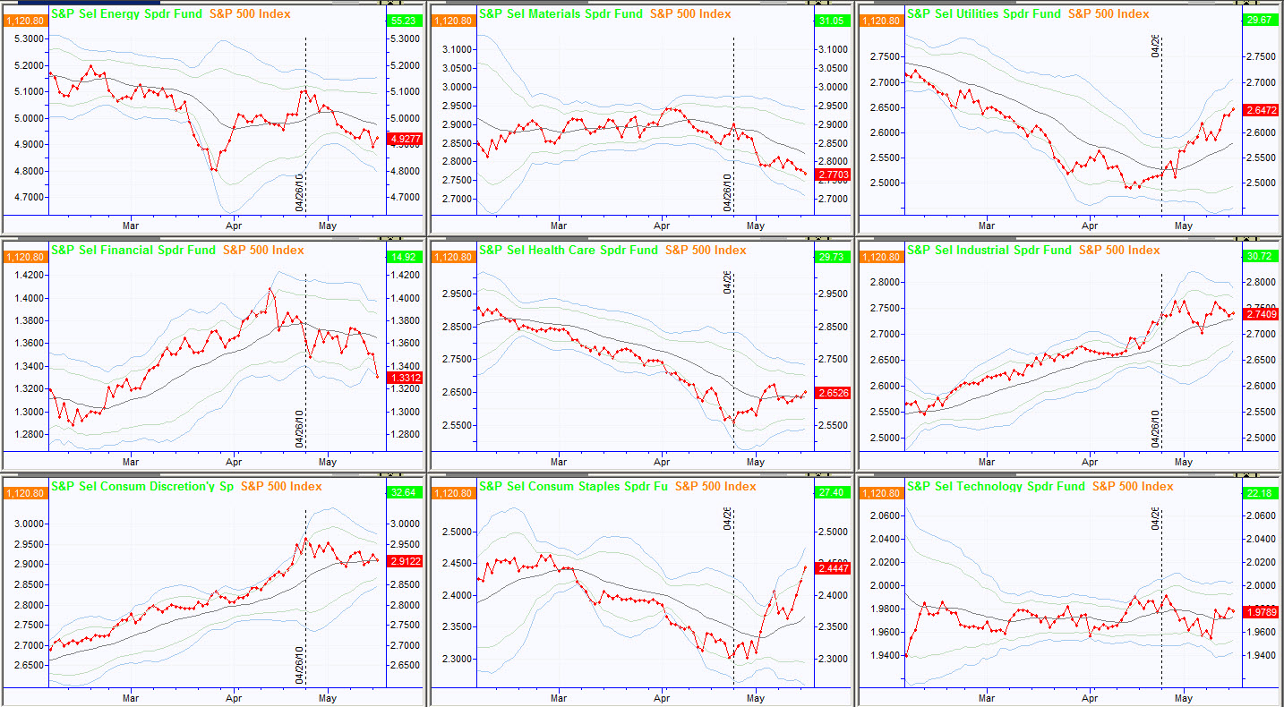
A few weeks ago I shared a charting technique that involved looking at ratio spreads between major sectors and the broad market. The market has had some significant moves since then, and I thought it might be interesting to revisit this topic today. For each chart below, consider three points: 1) are there many extreme directional days showing a strong trend? 2) Does the average (solid black line) show a clear trend? Does that trend have any recent inflection points? 3) Also consider the pattern of the spread before and after the market high on 4/26/10 (marked on each chart with a vertical black line). These relationships are even more significant when you consider them in context of the overall big-picture technical structure of the market.
I also received a few questions on how to construct these charts. For each chart you need to collect daily closing prices for SPY and the relevant sector. Create a number for each day that is the closing price of the sector divided by the closing price of the SPY, and then graph that new number. This can be done easily in Excel if your charting software will not do it, but updating every day can be a bit of a chore.
Energy – Weak, but not incredibly so, which may be surprising given the recent news and weakness in some specific names. Note that the market high was the inflection point for this spread.
Basic Materials – Consistently weak and driving down. Moving average turned down before the market high. This, to me, was a clue at the time that the bull market was losing steam: one of the strongest sectors had rolled over before the broad market turned.
Utilities—The market high was a clear and sharp inflection point for this spread. Note the average turned around that point as well. This is a traditionally defensive sector, so strong money flows into this sector are probably indicative of risk aversion.
Financials—Ouch. What more can we say? Hit very hard before the market high and several times since. Today was also a bad day for this sector.
Healthcare—While not always considered to be a defensive sector, I have argued that it should be. The market high was the exact low for this spread. Coincidence?
Industrials – This should catch our eye for its consistency. Leading the market before the market high and continues to be relatively stronger than the market. Notice how the spread becomes much more volatile after the market turns. (Does this make your head hurt a little? We are now considering the volatility of the ratio of a specific subset of the general market to the general market itself. Whew…)
Consumer Discretionary – Is it coincidence that the market high was the exact high for this, probably the most cyclical of sectors? Perhaps, but we are seeing a consistent story build throughout this analysis.
Consumer Staples—And this, probably the most defensive of sectors, is showing exceptional strength relative to the broad market. Does this suggest a move to risk-aversion and a major shift in investor psychology? Taken alone, there probably is not enough information here to draw that conclusion, but a different picture emerges when we consider the overall structure in the market.
Technology—In-line and fairly unremarkable.
I will leave it to you to draw conclusions, but I hope you see how this type of analysis can add a new dimension to your macro analysis. As a final exercise, it might be interesting to review the individual charts of these sectors for the same timeframes to see how the spread charts reveal relationships that are not always apparent on the charts themselves.

